Sideshow Collectibles has revealed their coming Wolverine Premium Format™ Figure and I will now give my initial thoughts on this piece based on the material currently available. This should not be considered a review, but rather as my first impression of the piece.
Facts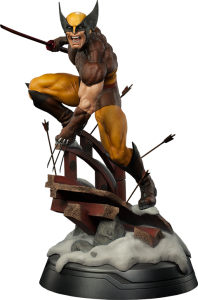
- Price: $479.99
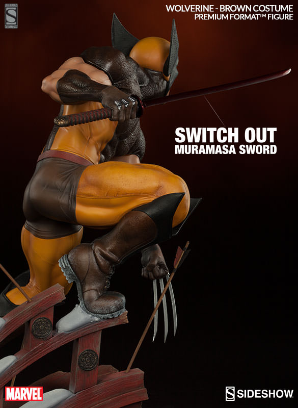
- Exclusive: Additional right hand with Muramasa Blade
- Expected to ship: Jul 2016 – Aug 2016
Collectors have been waiting for a new Wolverine Premium Format for ages, and especially one featuring the classic yellow/brown costume design. Well, now we finally have it coming, but does it live up to expectations? Let’s have a closer look!
The Sculpt
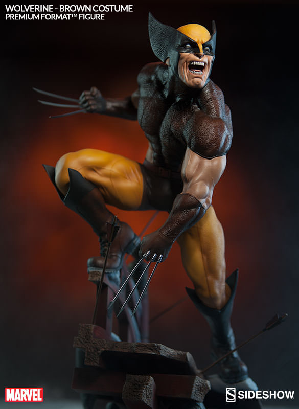
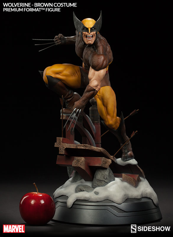
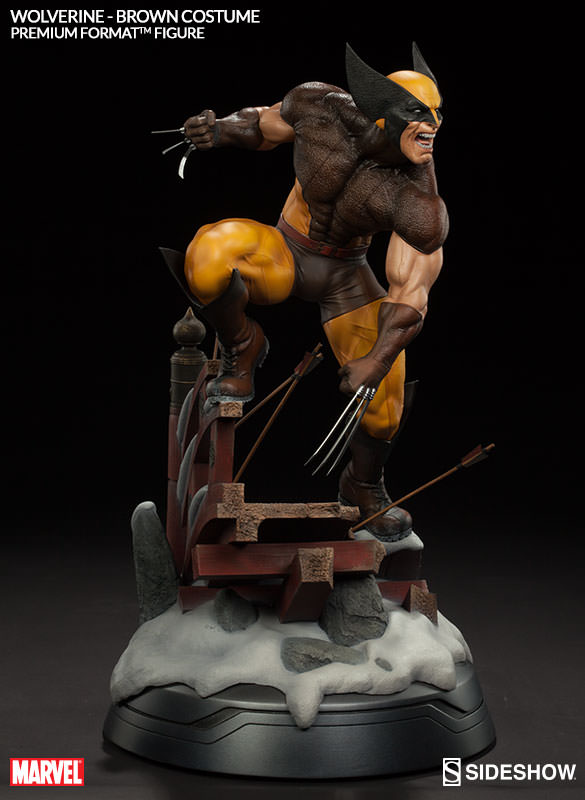
I’ll have to admit from the very get-go: the sculpt leaves me with mixed feelings. Let’s start with what I like. I find the muscle definitions and the overall physique of Wolverine very nicely done. The arms, the back and the thighs make Wolverine appear strong and powerful. It would also seem like Sideshow has taken Logan’s short stature into account when designing this statue.

Now, let’s have a look at some of the aspects of the sculpt that I find less appealing.
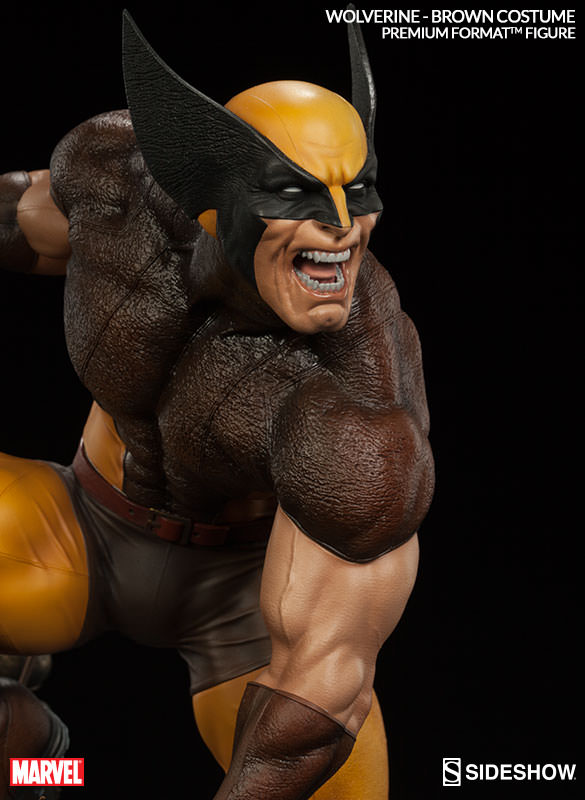
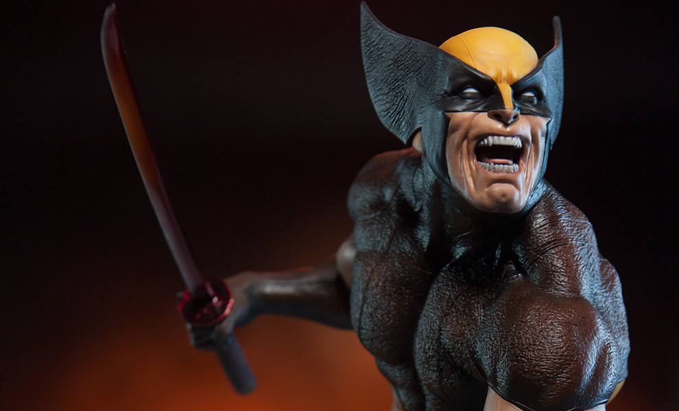
Firstly, the portraits. I have to say that I feel that the portraits are taking away from my overall impression of this piece. I’d at best describe the portraits as unique and characteristic. They surely convey the rageful and animalistic nature of Wolverine, but I feel that they tried a little too hard to expose his upper teeth, thereby reducing his upper lip. Personally, I feel that when you strive to realize a comic book hero, you have to balance between creating a realistic and authentic look, whilst at the same time achieving a somewhat generic look. This is of course down to personal preference, but it’s surely how I feel, and I think that Sideshow went a little too far trying to realize the portraits of Wolverine in a suitable way.
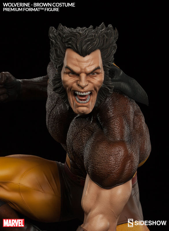
Of the two portraits, I prefer the masked version. The mask is iconic, and I feel that it is essential for the costume to pop.
Sideshow decided to add a rugged look to the texture of the upper torso and the shoulders. I’m not really sure what this texture is supposed to imitate. It could be leather, but it doesn’t really look like it. I would’ve preferred a more clean texture similar to that of his pants.
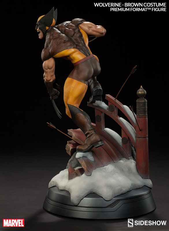
Finally, the boots seems to combine regular combat boots with the classical Wolverine V-shaped top. I don’t really like the combat boot aspect of the boots with the lug sole and the detailed laces. I’d prefer a more simple and comic-like appearance.

Despite my ambivalence towards some parts of this sculpt, my overall impression is that it manages to capture the personality of Wolverine quite well. When looking at the piece as a whole, I like the dimensions and proportions of it. There’s a good balance to the piece.
The Pose
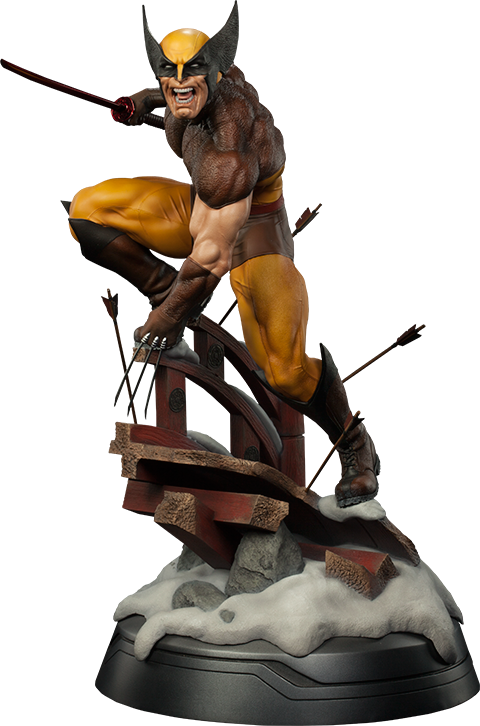
I think the pose is strong with this piece (sounds “Star-Wars-y”, I know). It emphasizes his animalistic nature. He is standing on a structure, and it almost seems like he is leaning a bit forward. It to me feels almost like he is hunting someone, and now he can’t reach them, so he’s standing on the ledge making furious snarling noises (which is conveyed by his portraits).
His entire body pose communicates his rage and killer-instinct and it really manages to express his animalistic qualities. I think it’s a very solid pose, and they did a good job making it fit well with the character.
The Base
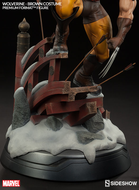
This statue, being inspired by Wolverine’s journey to Japan, manages to communicate the theme of Japan quite well with the traditional bridge and the snow-covered landscape. When I saw the base, it immediatly made sense to me. Maybe it’s all the times that this “picture” has been painted to us in movie tradition (e.g. Kill Bill). There are arrows scattered around the base, which fits to the theme and the story very well. So there is no doubt that the base most definitely contributes to the overall experience of this piece. It frames it and adds flavor. However, I feel that the base could still have been more aggressive in trying to set the scene. There could have been more structure, both in front of and behind the character. The ground could have had more detail and a more varying texture. All we get is rocks, snow and red painted wood. There could have been some spots of grass on the ground. There could have been a traditional Japanese lantern somewhere – maybe a busted one on the ground. This could even have provided the option of a casual light-up feature.
In other words, the base could have been a tad more ambitious and impressive. It does what it has to do, but I like it when a base goes slightly above and beyond. It just adds to the wow-factor.
The bottom base that kind of breaks the mood doesn’t bother me. We see this on several of Sideshow’s newer Marvel/X-Men releases, and I think it’s OK. It doesn’t distract me.
The Exclusive
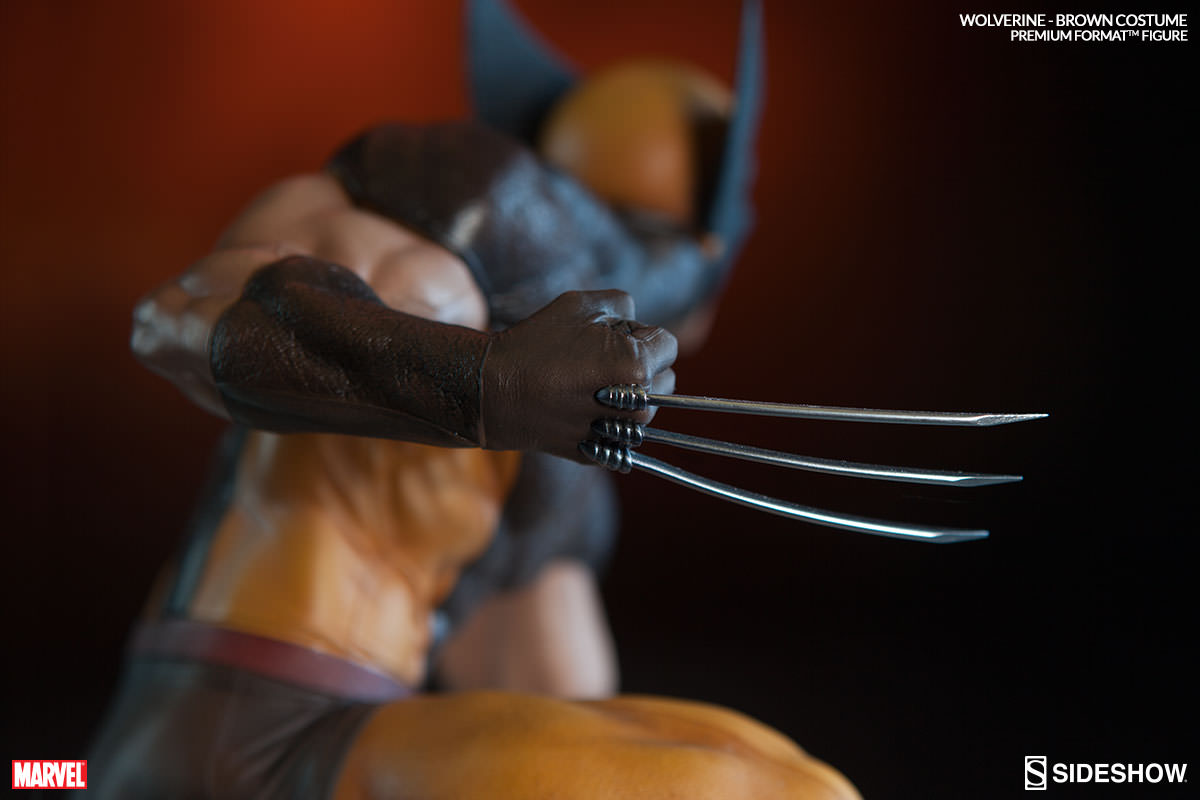
The piece comes with an additional hand featuring a Muramasa Blade (famous Japanase swordsmith). Honestly, I don’t think that the exclusive is a must… at all. This is Wolverine, and I by far prefer seeing both his sets of claws out. It just feels more natural to the character. The sword unsurprisingly fits well with the overall theme and setting of this statue, but… I just want to see them claws.
Final Thoughts
It’s cool to see Sideshow make a yellow/brown-suited Wolverine. People have been asking for this for years, and it’s difficult not to kind of hope that they are trying to listen to their customer base. There are many other Wolverine statues out there today, but most of them feature the classical yellow/black/blue suit – unless they’ve been customized. This piece feels like a typical Sideshow release. It has a very solid body sculpt. The base is efficient, but nothing more. The portraits are advanced, but in this case they are done in a way that really splits the audience. You either like them, or you hate them. They might grow on you, but I think that is something time will tell once people get this piece and can experience it first-hand.
So, how would I rate this particular statue up against the competition? Personally, I prefer the Wolverine by XM Studios. It has many of the same qualities as this one, but it goes a bit above and beyond, and some smaller details of the XM piece are more to my liking. It’s very difficult to compare the new Wolverine Premium Format to the old one. Both of them have their individual strengths and weaknessess, but the old one is rather expensive today. I’d like to be able to say that I prefer the old one, but to be quite honest, to this day, I’m still not entirely sure how I feel about the use of fabrics on the old Premium Format.
If I was in the market for a Wolverine statue (say, if I didn’t have him represented in my collection already), I’d feel confident getting this new Wolverine Premium Format. Yes, there are some things about it that I would change, but it’s still a solid piece. The pose is great, and I think that is one of the most important aspects about this piece. The portraits require some getting used to, but to be honest, I think they will grow on you over time. Lastly, the yellow/brown suit just looks amazing. The colors compliment each other so well, and the overall look is great.